MOODBOARD –Artistic style and emotional expression (photo1)
For the visual style, I chose bright, saturated colors and combined them with surreal dessert world elements. The images in the moodboard show gorgeous gradient colors, candy-like soft sheen, and fantasy-filled floating clouds and cake scenes. These images became an important source of inspiration for the game environment and character design. For example, the “cloud cake” and “rainbow cake” in the picture both convey a dreamy and healing atmosphere, which echoes Ellie’s journey of finding herself and breaking free from the shackles of tradition.
UI design( photo 2)
The initial UI design was inspired by the game’s environmental color and style. I designed chocolate-colored UI elements and suspended them in the air, with the intention of allowing players to more intuitively understand how to operate during the experience. At this stage, the purpose of the UI is to convey important interactive prompts without interrupting immersion, so I chose soft colors and simple lines to make it blend into the scene as much as possible.
Iteration and Adjustment
As the game scene was updated, I gradually realized that the UI not only needed to fit in with the visual environment, but also had to guide the players more clearly. Especially in some more complex interactive tasks, players need clear feedback to know whether their operations are correct. Therefore, I iterated the UI, making it more prominent in color, using gradient colors to echo other elements of the dessert world, and making it easier to notice.
For example, some prompt UIs in the game, such as the “How to Fix It” operation instructions, were originally simple text and symbol logos, but in subsequent versions, I added more visual elements to intuitively display the operation steps, such as using indicator arrows and highlights of interactive parts to guide players.
Latest Update
The current UI has been fully integrated with the overall scene and no longer appears abrupt. It appears in a more visually appealing form, and it also fits the dessert theme of the game very well. For example, in the scene, I added some soft candy-colored borders and glow effects to make the prompts look like they are emerging from the game world itself without breaking the immersion. These new designs make it easier for players to understand the tasks they need to complete without having to spend too much time to understand the meaning of the prompts.
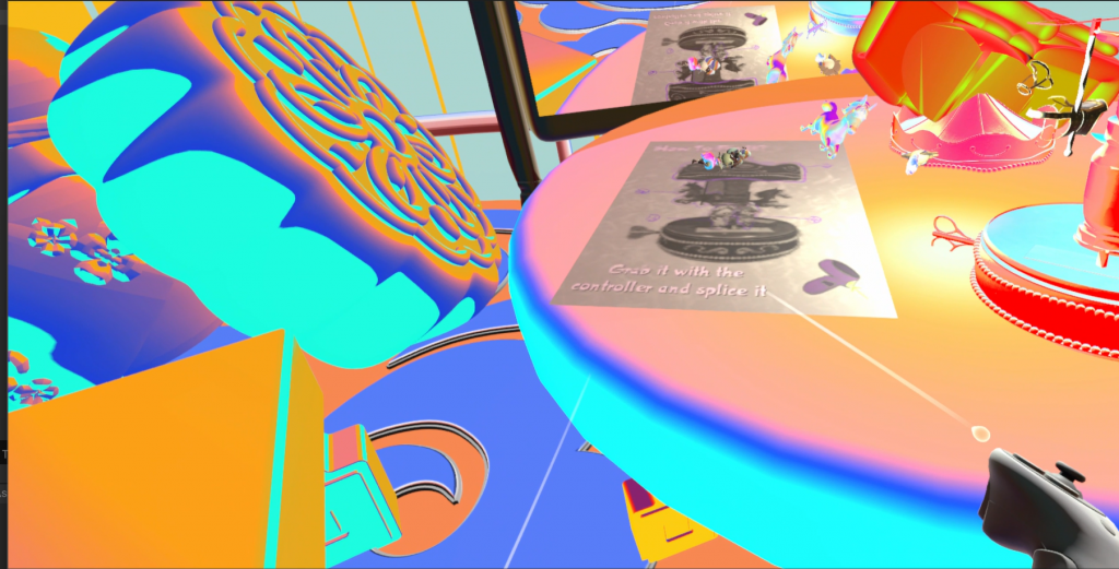
Final UI in project